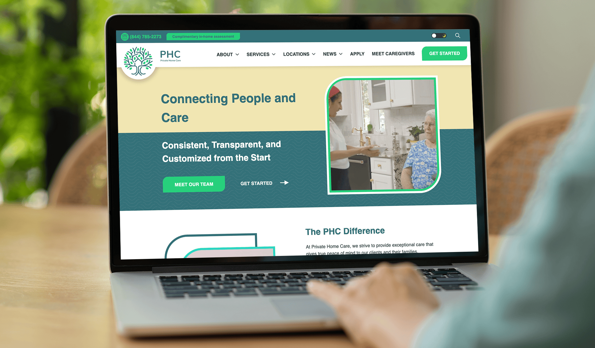
Providing Exceptional Care at Home, Wherever Home May Be.
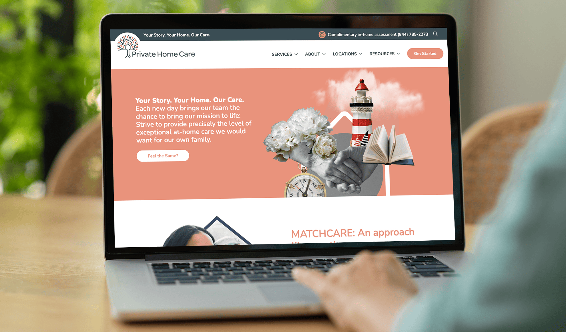
BRANDING | MESSAGING | WEBSITE | SIGNAGE | PRINT COLLATERAL
CHALLENGE
For adult children wanting to ensure their aging parents receive the care they need, the decision is deeply personal, often filled with stress and emotion. The home care industry is saturated with providers who look and sound indistinguishable from one another, creating a barrier for families who desperately need a partner they can trust while navigating some of the most difficult decisions of their lives.
Private Home Care (PHC) recognized the critical challenge of carving out a unique position to rise above the “sea of sameness.” PHC knew they had to stand apart as a trustworthy, compassionate partner and wanted their brand to authentically reflects their personalized care, family values, and their commitment to the families they serve and the caregivers they employ.
STRATEGY
Your Story. Your Home. Our Care.
To tackle this challenge, we set out to transform Private Home Care’s brand into something authentic, relatable, and unmistakably their own. We developed and executed a comprehensive differentiation strategy that began with the heart of PHC’s mission of giving families peace of mind through expertise, and consistent, personalized care. With this foundation, the team created a person-centric narrative and visuals that convey trust and compassion.
At the core of this transformation was PHC’s hallmark service—their One-to-One Care model, which pairs clients with a dedicated care team. Werremeyer reimagined and reintroduced it as MatchCare™. More than just a name change, it was a way PHC could emphasize their approach to care and highlight what truly set them apart: exceeding the needs of clients with care tailored to the individual and delivered with unmatched professionalism.
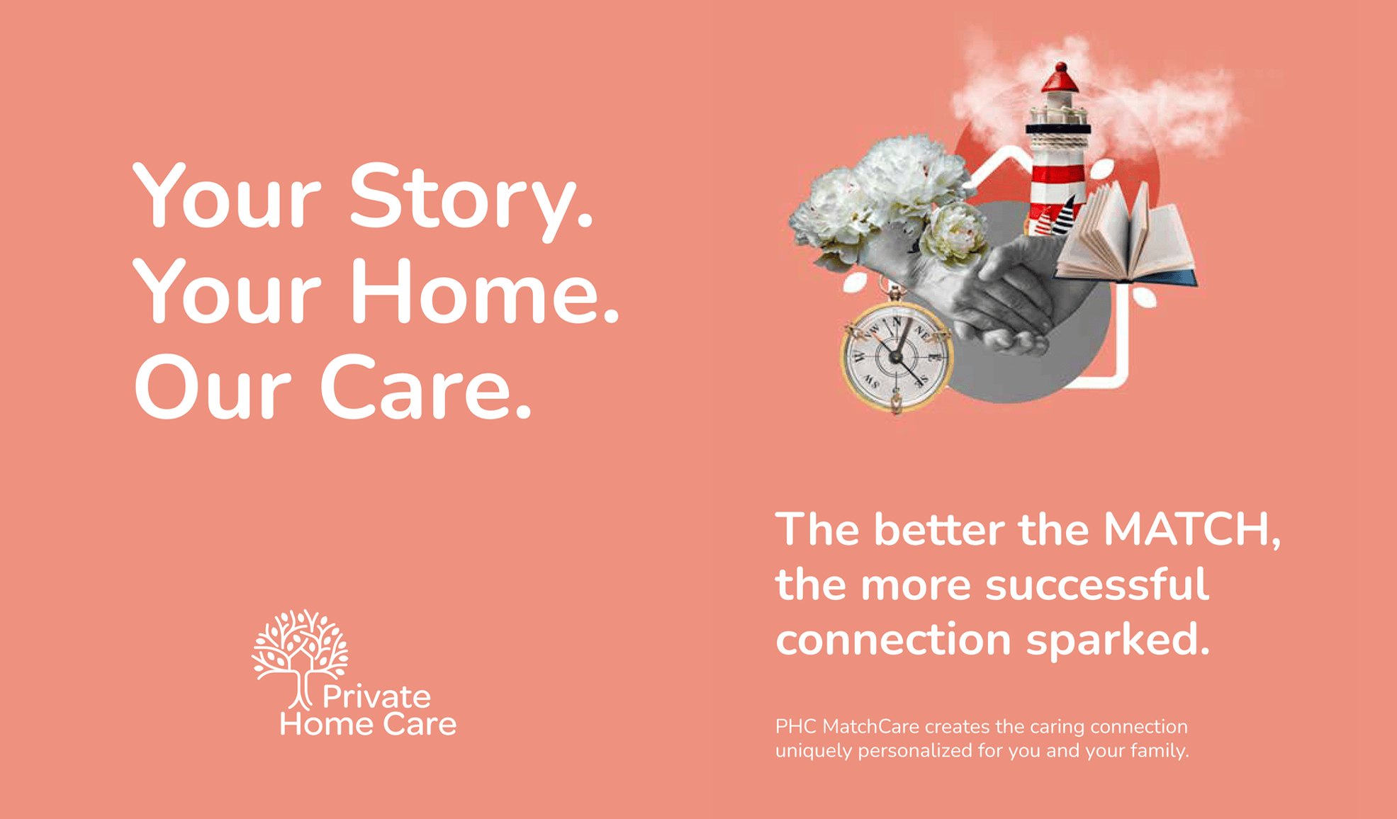
memories ARE chapters in THE STORY OF YOUR LIFE.
Memories are captured in the keepsakes and artifacts we collect over our lifetime. For older adults, these items—family photos, heirlooms, and personal treasures—hold deep meaning, making their home a reflection of their life’s story. When we rebranded Private Home Care, we wanted to honor that connection. We created a series of four collages, each made up of images that, together, represent the richness of a person’s story. These collages highlight PHC’s personalized care philosophy and became the backbone of a cohesive new look.


Crafting an Authentic Brand Rooted in Personalized Care
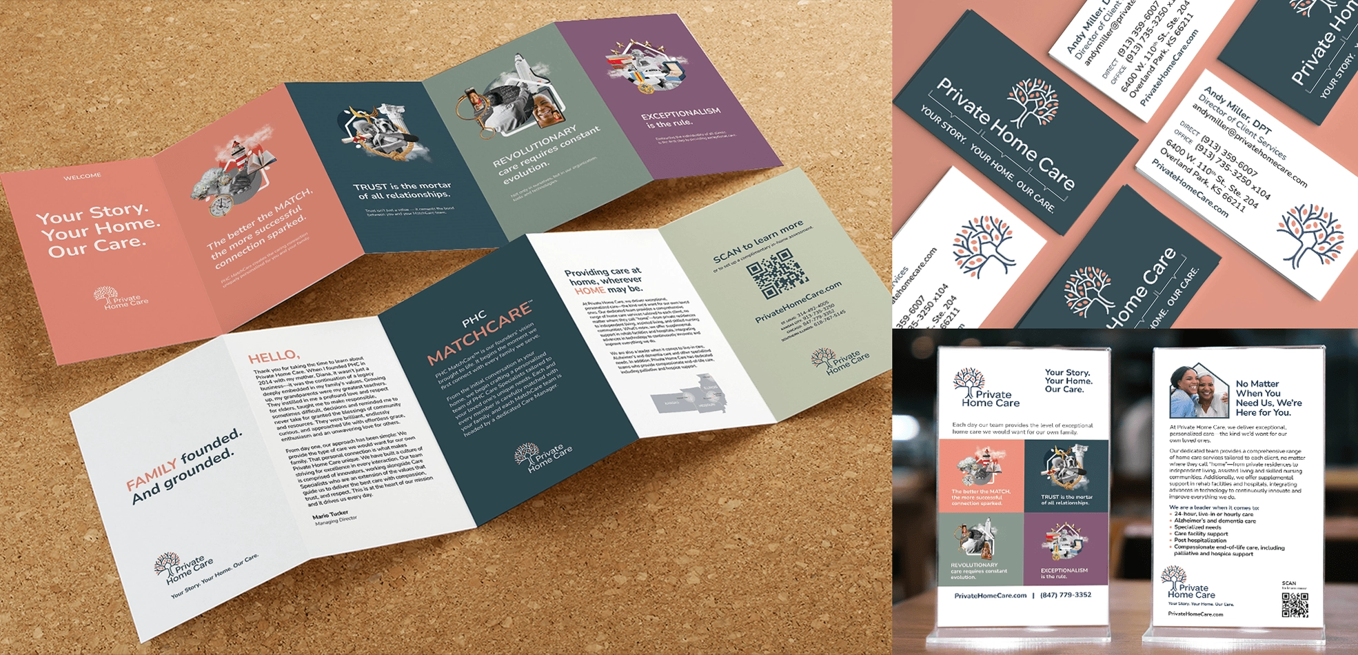
The brand development extended beyond refreshing the logo. PHC’s visual identity and color palette was revitalized, transforming their business cards, brochures, flyers, signage, banners and website into tools that reflect professionalism and warmth. Every element tells the same story: PHC is not just another in-home care provider.
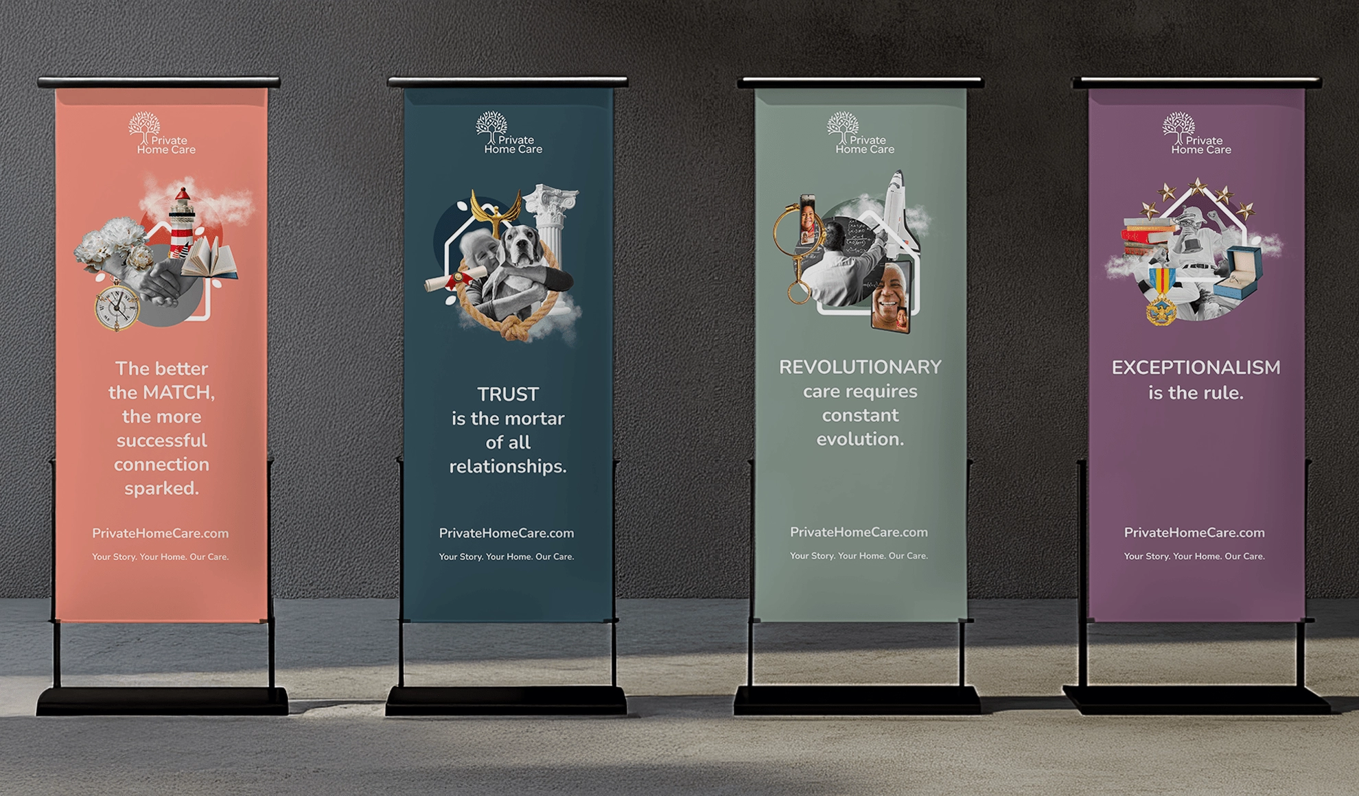
Thank you for your beautiful work and your partnership. We are thrilled to work with such creative, kind and fun people. Your talent is top-notch.
– Sara Gibbons | Regional Director of Growth – Private Home Care
OUTCOME
Elevating an in-home care brand to stand out by connecting deeply and caring differently.
The results of PHC’s rebranding were as emotional as they were impactful. Families who come to PHC don’t just see a provider—they feel a connection to a company that understand their struggles and they find reassurance in the care and compassion PHC offers, a sentiment echoed by one client who said, “I trust the people at Private Home Care to make my Mom’s house remain Home.”
The MatchCare™ model became a powerful differentiator to resonate with prospective clients who want more than just a caregiver—they want a team they could trust completely. The redesigned website and marketing materials captured this sense of trust and authenticity, creating a consistent and professional image that stands out in a crowded market.
Werremeyer highlighted PHC’s superior caregiver pay, benefits, and retention, showing that their commitment to quality care starts from within. It wasn’t just about attracting great caregivers; it was about ensuring that families could count on consistency and compassion from the people they welcomed into their homes.
Ultimately, PHC’s rebranding is more than just a visual refresh—it is a transformation of how they tell their story. They rose above the “sea of sameness,” showing families that they aren’t just another provider, but a partner who could bring stability, calm, and peace of mind. Overwhelming praise from clients and their families is a testament to the emotional impact of care that truly stands apart from the competition.
More of Our Work

Gateway to Hope
Brand refresh helps non-profit on a mission to lower the rate of incurable breast cancer and eliminate barriers to quality breast health care.
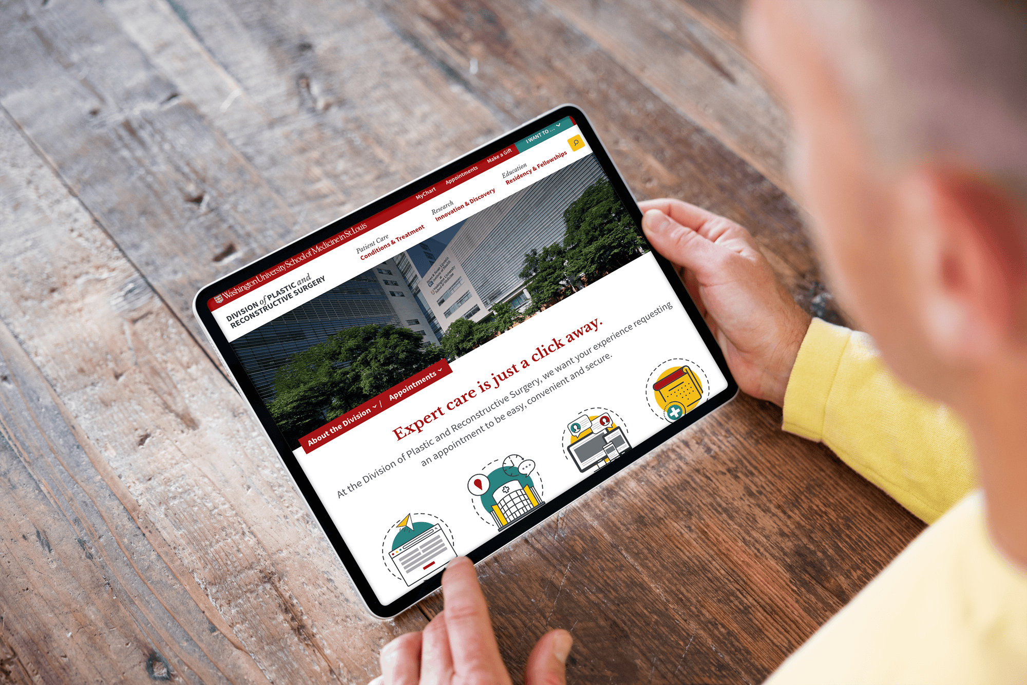
WashU Medicine – Division of Plastic & Reconstructive Surgery
Dynamic new website increases brand awareness, appointments & referrals for a leader in transformative care.
Your brand. Your specialty. Our expertise.


